Custom cut mocks w/certified (opinions wanted)

Disclaimer: Links on this page pointing to Amazon, eBay and other sites may include affiliate code. If you click them and make a purchase, we may earn a small commission.

worldwideed

MVP
1,144
5.00 star(s)
Joined
Oct 7, 2005
Messages
12,076
Location
Northwest Washington
Ok, I'm still not sure how I feel about this even though I have completed a few.

Why: Basically, I'm running out of ways to get Mariners items. Lots of guys I have left don't have mariners cards, don't sign TTM or BOTH. So this is my solution.

So far no card had been hurt in the making of this project. I simply cut a window in my mock custom and slid it in fort of the certified in a penny sleeve.

If you were a team collector how would you feel about something like this being in your collection?

Josh Wilson
The smokey look comes about 90% from the sleeve.
wilsonjosh.jpg


Randy Messenger
Had a hard time finding a good photo
messengerrandy.jpg


Jose Guilen
Does something like this work on a 'vintage' design?
guillenjose.jpg
 
Ed,
I prefer that the cutout be part of the design. Those are some great looking customs based on old designs (the 81D looks real sharp), but I'm personally not a fan of what seems to be a random box cutout. Kind of reminds me of 02 UD Prospect Premieres autos.
(Hope that didn't come off as being a jerk, just my $0.02 :) )
 
@Benson there are few people's opinion I would respect more on this than yours so I appreciate and WANT the feedback.

Can you give me some examples, either certified or something you have done. I'm not sure I totally understand?

EDIT:
Right now I leaning on re-doing the Messenger with something else, the others I like enough. Any nice tips I get form this I'll apply to my next batch as I will need to do many.
 
I'm going to guess Benson means something like the cut-out disrupts the flow of the photo. You have most of the photo up top and a very small amount below the cut-out. It doesn't look quite right to me, not that the pros didn't do this on cards as well at times.

I like the 81D border for Guillen, but the picture looks grainy. It could be presented an artsy type of card, as the grainy picture could look like a painting, but I guess with the 81D design, I am expecting a crisp picture (not that Donruss didn't have any lousy photos in that set).

The cut-outs are a little rough, but now I am just nitpicking. I wonder if there is an easier way of getting a clean punch-out or cut-out that doesn't look obvious. Probably not on a custom card budget, as this might be a specialty tool or device?

In light of my constructive criticism, I do like all three though and wouldn't be ashamed to have them in my collection if I needed the signatures. I'd rate them a B+ or so, overall.
 
Might be hard to "design" the cutout area into the custom since you are chasing stickers around the various certified autos.

It'd be nice if you had a template of a few certified auto designs to use, i.e. the custom card looks kind of like the old card, with an updated photo, so the sticker looks natural. I love the 89 UD design though and did several customs for other people using that design myself.

I don't envy anyone doing cutouts because of the steady hand and patience required (not to mention a good sharp blade).
 
I'm the process of doing the same, so I am all for the idea...I have a whole bunch of 1996 Leaf autos that I am in the midst of doing this with, since they are very cheap cards....

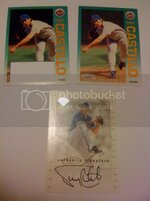
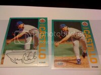
Here is my first....Tony Castillo
Using 2 base Met cards, one for the front cut and the other for the back.I have the 96 Leaf in the middle.I have actually used spray glue to attach them together.

castillo.jpg

castillo2.jpg
 
Thank you all for the advice.

I'm going to guess Benson means something like the cut-out disrupts the flow of the photo. You have most of the photo up top and a very small amount below the cut-out. It doesn't look quite right to me, not that the pros didn't do this on cards as well at times.

I like the 81D border for Guillen, but the picture looks grainy. It could be presented an artsy type of card, as the grainy picture could look like a painting, but I guess with the 81D design, I am expecting a crisp picture (not that Donruss didn't have any lousy photos in that set).

The cut-outs are a little rough, but now I am just nitpicking. I wonder if there is an easier way of getting a clean punch-out or cut-out that doesn't look obvious. Probably not on a custom card budget, as this might be a specialty tool or device?

In light of my constructive criticism, I do like all three though and wouldn't be ashamed to have them in my collection if I needed the signatures. I'd rate them a B+ or so, overall.

The Guillen does have an art effect to it. It looks better in person than it does on the scan.

The cutouts are rough. The Guillen and Wilson cuts look worse in the scans than in person because I scanned them so LARGE. The Messenger looks like crap either way so I will be redoing it at some point probably with a different, more suitable design.

Might be hard to "design" the cutout area into the custom since you are chasing stickers around the various certified autos.

It'd be nice if you had a template of a few certified auto designs to use, i.e. the custom card looks kind of like the old card, with an updated photo, so the sticker looks natural. I love the 89 UD design though and did several customs for other people using that design myself.

I don't envy anyone doing cutouts because of the steady hand and patience required (not to mention a good sharp blade).

Precisely, I am cashing them around because I can't bring myself to destroy the original card just yet. Once I get over that I will have lots more freedom.

It has been challenging to get a nice cut even with a new blade and metal rule, I suspect I will get better as I plan on doing tons more of these this year.

I'm the process of doing the same, so I am all for the idea...I have a whole bunch of 1996 Leaf autos that I am in the midst of doing this with, since they are very cheap cards....
Where do you think the idea came from. :)
 
I dont know what you are using for a knife but I found that (Exacto) knives work pretty well. Nice job regardless.
 
Back
Top