You are using an out of date browser. It may not display this or other websites correctly.
You should upgrade or use an alternative browser.
You should upgrade or use an alternative browser.
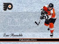
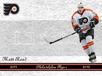
tinkering with a new Flyers custom
- Thread starter walston32
- Start date
Disclaimer: Links on this page pointing to Amazon, eBay and other sites may include affiliate code. If you click them and make a purchase, we may earn a small commission.
I like the design, simple, autograph should stand out.
Just my opinion, but not a fan of Times New Roman (or very similar font) used for "Philadelphia Flyers." Also, try spreading out the team name across the card more and see how that looks compared to the original.
Just my opinion, but not a fan of Times New Roman (or very similar font) used for "Philadelphia Flyers." Also, try spreading out the team name across the card more and see how that looks compared to the original.
I like it. Only things I would alter are that I would make that background a little whiter, looks kind of blue, and maybe the player name slightly larger?
Great looking design man!!! 
Great looking design man!!!
thanks buddy !!!
Similar threads
- Replies
- 18
- Views
- 931
Trade night
0
Days
00
Hours
00
Mins
00
Secs
Latest posts and bumps
-
-
-
WTTF Topps Home Run History & Mantle Story Inserts
- Latest: DaBaddestHic
-
-
-
-
-


