You are using an out of date browser. It may not display this or other websites correctly.
You should upgrade or use an alternative browser.
You should upgrade or use an alternative browser.
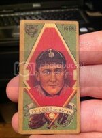
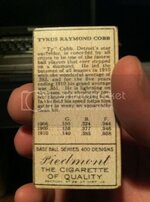
Question About 1911 Piedmont Goldborder Ty Cobb
- Thread starter Konel07
- Start date
Disclaimer: Links on this page pointing to Amazon, eBay and other sites may include affiliate code. If you click them and make a purchase, we may earn a small commission.
I would pose that question here and I'm sure you'll get an answer.
http://www.net54baseball.com/usercp.php
Those guys are not shy about telling people what they think. Looks to be in great shape, but it also looks like it was either trimmed or cut. The borders are uneven. I guess I would assume fake unless there was a real believable story behind it. If you told me you got it at a flea market or a garage sale or it was in a lot of stuff you bought, then I'd almost definitely assume fake.
I don't think you just come across stuff like that at bargain prices these days very often and the real stuff would be expensive and there should be no question that it's real then.
thanks man! i have created an account and awaiting activation
Not even close to a real one, IMO. They really should have used the right color ink on the back. I've personally never seen a Piedmont where the team name runs into the border margin- can't say it doesn't exist, but I've never seen one in person. And why does the card look so washed out and fuzzy in comparison to the fingers where you can clearly see detail like fingerprints?
That is the 1st thing I notice when looking at graded pics of the exact same card! And the coloring is dull compared to graded versions that I have seen.. Judging by the evidence it's not even a good fake
Similar threads
- Replies
- 10
- Views
- 976
- Replies
- 10
- Views
- 1K


