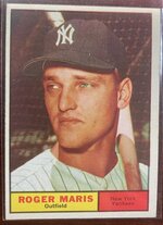
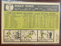
Show a pic of a random card you own thread..

Disclaimer: Links on this page pointing to Amazon, eBay and other sites may include affiliate code. If you click them and make a purchase, we may earn a small commission.

And a pretty awesome one at that! I think these posters finally increased in value over the past 5 or 6 years. Their value was stagnant for decades with the Mantle poster only booking at $20. I know they have gone up and I hope the Mantle is over $100 these days.

It is funny how Topps recycled the same photos over and over in this era. The 1966 Topps Mantle and the 1967 Topps poster are the same exact photo.

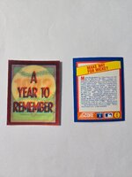
@SymphonicMetal

Believe it or not - but the Mantle poster only books $30! Crazy!

Scobes
 
@SymphonicMetal

Believe it or not - but the Mantle poster only books $30! Crazy!

Scobes
I am shocked at that current value. I thought for sure the posters would follow the price rise of the 1968 Topps Game cards which were ridiculously low and now have gone up substantially.

Despite so many sports cards being overpriced these days, there still are great buys out there even at high BV. $30 high book cor a 1967 Mantle poster. I'd take money out of the bank to buy thoe by the score at that price.

BTW no gum stain on the back of your Mnatle!!! Those posters suffered greatly from those if they were on the wrong side of the pack.
 
@SymphonicMetal

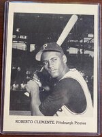
That is a 1963 Pirates Jay Publishing #3 Roberto Clemente.

This is from PSA:

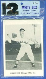
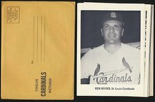
Jay Publishing issued 12-card picture packs of various major league teams over the course of eight years. The cards measured 5”x7”, and were printed in black and white. Card stock was typically glossy and slick, although other types were used as well. The cards were distributed in brown or white envelopes or clear plastic bags, and were for sale by mail, in ballparks and in stores, and did not change in style greatly over the years. In fact, a difference in font is the only real distinction between the cards produced from 1958-1961, and those printed from 1962-1965. The earlier, Type 1 cards, used a sans-serif typeface, while Type 2 cards (1962-1965) used a serif font. The card fronts featured player/manager name, city and team along the bottom border. Photo pack contents sometimes changed with roster moves during a season, expanding some of the team checklists beyond 12 for a single season. Jay Publishing also produced team yearbooks during this period, and the same images were often used in both the cards and yearbooks.

They were issued by teams from 1958 to 1965.

Here is a pic of a plastic pack:

61j-wsox.jpg

Here is a pic of the Envelope:

s-l400.jpg

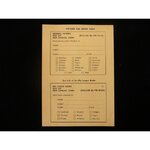
Here is an order form:

set-of-12-1960s-jay-publishing-5-x-7-chicago-white-sox-picture-pack_ss2_p-10504302+pv-4+u-15yh...jpg
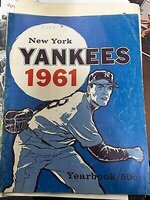
Here is a pic of the yearbook:

s-l400 (1).jpg

A fun vintage issue!

Scobes
 
@SymphonicMetal

That is a 1963 Pirates Jay Publishing #3 Roberto Clemente.

This is from PSA:

Jay Publishing issued 12-card picture packs of various major league teams over the course of eight years. The cards measured 5”x7”, and were printed in black and white. Card stock was typically glossy and slick, although other types were used as well. The cards were distributed in brown or white envelopes or clear plastic bags, and were for sale by mail, in ballparks and in stores, and did not change in style greatly over the years. In fact, a difference in font is the only real distinction between the cards produced from 1958-1961, and those printed from 1962-1965. The earlier, Type 1 cards, used a sans-serif typeface, while Type 2 cards (1962-1965) used a serif font. The card fronts featured player/manager name, city and team along the bottom border. Photo pack contents sometimes changed with roster moves during a season, expanding some of the team checklists beyond 12 for a single season. Jay Publishing also produced team yearbooks during this period, and the same images were often used in both the cards and yearbooks.

They were issued by teams from 1958 to 1965.

Here is a pic of a plastic pack:

View attachment 101981

Here is a pic of the Envelope:

View attachment 101982

Here is an order form:

View attachment 101983
Here is a pic of the yearbook:

View attachment 101984

A fun vintage issue!

Scobes
Wow! So it was a team issued item! Awesome! That is a really nice item!!!

Speaking of yearbooks, I heard that MLB teams no longer put those out. Is that true? I also heard that game programs are a thing of the past as well.
 
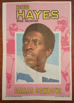
Here's my mini-poster... not nearly as nice as Scobes' though!
Bob Hayes 1971 Mini Poster
View attachment 101995
I absolutely love those late 60s/early 70s football poster inserts. I think there were three sets of them, 1971 (pictured aboce), 1970 and 1968. Topps really outdid themselves with the really fantastic football inserts in that time period like stand ups, 4 in 1's, glossy inserts and of course the posters. As a matter of fact, you had 2 of those Glossy inserts on your site with the Namath and the really sharp Jackie Smith the latter of which ended up somewhere in New York.
 
I absolutely love those late 60s/early 70s football poster inserts. I think there were three sets of them, 1971 (pictured aboce), 1970 and 1968. Topps really outdid themselves with the really fantastic football inserts in that time period like stand ups, 4 in 1's, glossy inserts and of course the posters. As a matter of fact, you had 2 of those Glossy inserts on your site with the Namath and the really sharp Jackie Smith the latter of which ended up somewhere in New York.
Lol ya and I kept calling him Jackie Harris...
 
Back
Top